Backtrack-free cursive
✑penmanship
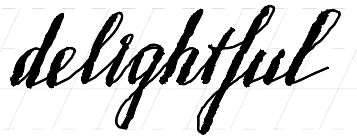
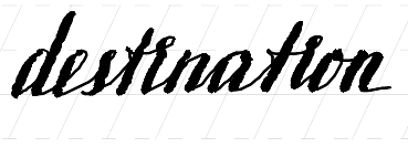
I love writing in cursive, shaping each word in one long stroke. If you grew up learning the Latin alphabet, you likely don’t realize how much joy it sucks out of cursive writing. I noticed only because I learned the Cyrillic alphabet first. I think and write primarily in English, yet Russian feels more enjoyable to write.
The crime
I narrowed the problem to backtracking—the need to add strokes to the letters I’ve partially written. English wants me to dot my i’s and cross my t’s. It has a lot of them, and they like to cluster in a single word. Instead of thinking about what I want to write next, I have to maintain a mental queue of pending strokes.
Backtracking is rare in Russian. Only й (short i) and э (pronounced like e in end) require two strokes. There is also ё (pronounced yo, like in New York), but its umlaut is optional. So much of Russian literature is written without ё that native speakers infer it unconsciously.

To quantify my discomfort, I analyzed Dostoevsky’s Crime and Punishment in Russian and English and computed how much backtracking I would have to do if I were to write it in cursive. The English version needs backtracking for 51% of words with 0.68 backtracks per word on average. In Russian, only 6.4% of words need backtracks, with 0.066 backtracks per word on average.
One way to remove backtracking is to lift the pen immediately instead of waiting until the end of the word, as if doing italic calligraphy. Pen lifts alleviate the mental queue problem and give a chance to readjust the palm, but they break the writing flow.
Dots and crosses are even more irritating on digital notebooks because the undo feature works on the stroke level. Often, I want to remove the last word I’ve written. If each word required only one stroke to write, I could do it in a single tap. But since every other word requires multiple strokes, I resort to the eraser tool, which is slower and more distracting.
The redemption
I couldn’t find a cursive script that would address my annoyances, so I designed one. It’s based on SmithHand, with occasional borrowings from the Russian script I learned at school. SmithHand renders most lowercase letters in one stroke, except x, t, i, and j.
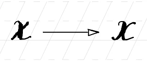
x is the easiest letter to fix. Instead of using two diagonal strokes, I draw two mirrored c’s, as my Russian penmanship teacher would suggest.
The fix for t is also straightforward. Instead of crossing the vertical line in a separate stroke, I add an auxiliary line that moves the pen up and left and then crosses the stem. It’s the same motion you’d use to draw digit 4, but mirrored both horizontally and vertically.
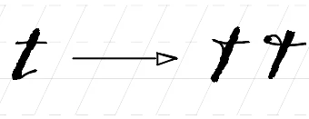
This variant of t often appears on logos. I counted three instances just walking around Zürich main station. For example, logos of Stocker bakery, Leonardo ice cream parlor, and the Hotelplan group use it. If it reads well on Swiss logos, it’s good enough for my scribbles.
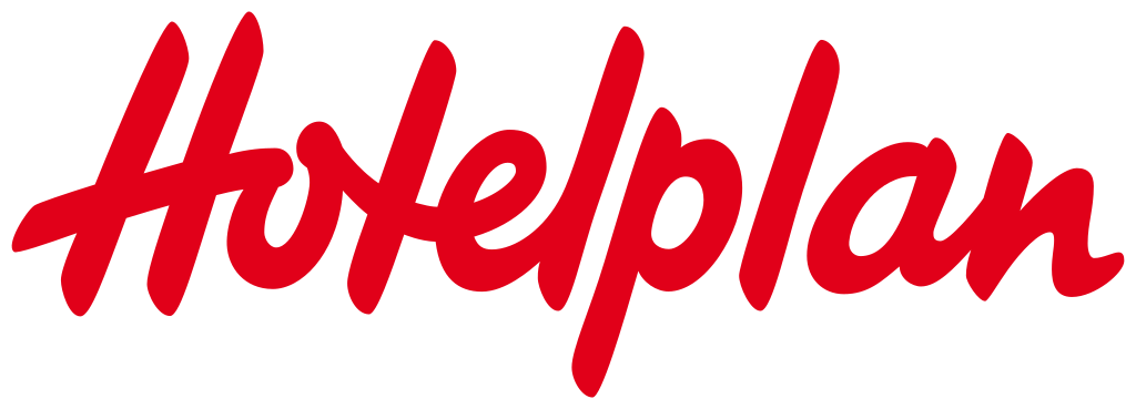
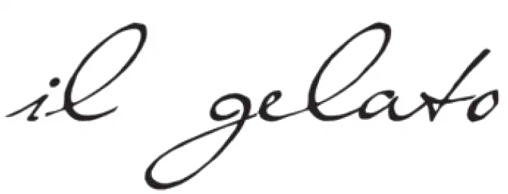
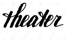
If you’re feeling fancy, you can make a loop on the upstroke, giving the letter a little bow. I prefer this variation in the th and te ligatures because it pairs well with its neighbors.
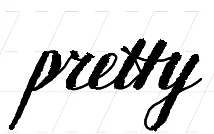
The tt ligature requires planning: draw two vertical stems first, then add a horizontal stroke crossing them both.
i and j gave me a hard time.
I tried skipping their dots entirely,
but the result was subpar.
I tried writing the dot before the stem,
trading a backtrack for a pen lift,
but I couldn’t get used to it.
It also broke the flow,
unless the word started with a dotted letter (as in in
or just
).
An acceptable solution must connect the dot and the stem in a legible way.
The breakthrough came from my prior experiments with dot shapes. I write with an extra-fine nib, so dots can disappear in a dense grid packed with letters. I considered using little circles instead. The change didn’t seem worth the trouble on its own, but the pen lift constraint gave the idea a new appeal: dots become invisible when connected to a stem, but circles remain distinctive.
The design that worked fuses the circle and the stem. To write an i without lifting a pen, I draw a tight loop above the midline that flows into a stem on the downstroke.
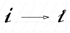
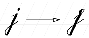
The placement and the alignment of the circle are crucial. If the circle is below the midline, the letter looks like a Greek ε. If the circle doesn’t align with the stem, the letter looks like an r.
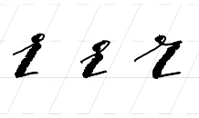
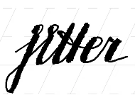
Word jitter is perfect for practicing the script because it contains i, j, and a challenging tte ligature.
Some capitals required minor adjustments. The horizontal bar of capital T turned into a loop. Capital F acquired a little bow that connects to the next letter. Capital K has two renderings: in two top-down strokes (requires a pen lift) or in one stroke that traverses the top arm twice (once up and once down).
Here is the full alphabet for reference:
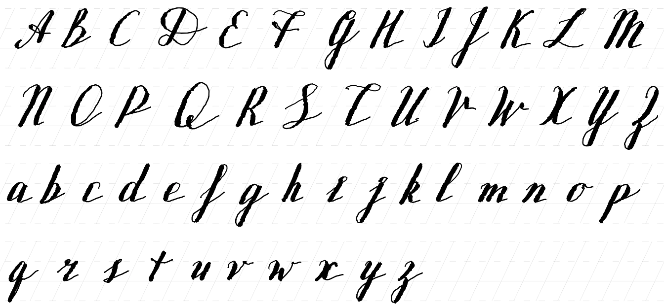
I’ve been using this script for several months, both on paper and digital notebooks. My i’s are still inconsistent, my t’s and x’s aren’t as elegant as they used to be, but writing English finally brings me as much delight as writing Russian.